Redesigning how millions of Indians invest with
Kotak Securities, a 25-year-old Fintech
Problem Overview
Context
Kotak gives clients market insights, stock recommendations and investment advice. Its online platform and mobile apps let them trade and manage their investments. The company offers equity, derivatives and commodity trading, currency derivatives, mutual funds, IPOs and portfolio management to retail, institutional and high-net-worth investors.
Why the redesign?
Most of Kotak's users were 50 or older, a loyal segment that trusted the brand. Young people took up trading and young competitors entered the market, so Kotak found it harder to acquire new users and hold its market share. To compete, it needed a visual direction that appealed to this younger segment without alienating its loyal base.
The Gap
-
Missed a new generation
The site served experienced investors and gave first-time investors no clear place to start.
-
Branding
The site looked old next to competitors, so visitors saw an old brand.
-
Weak visual hierarchy
Pages shared no common structure, so sections looked disconnected.
-
Hard navigation
Five platforms sat on a long, winding path with no product list or plan comparison.
-
All of the above led to poor user engagement.
Our Approach
Research
-
Competitor research
We benchmarked broker and fintech websites on landing pages, content flow, lead generation and engagement.
-
Positioning
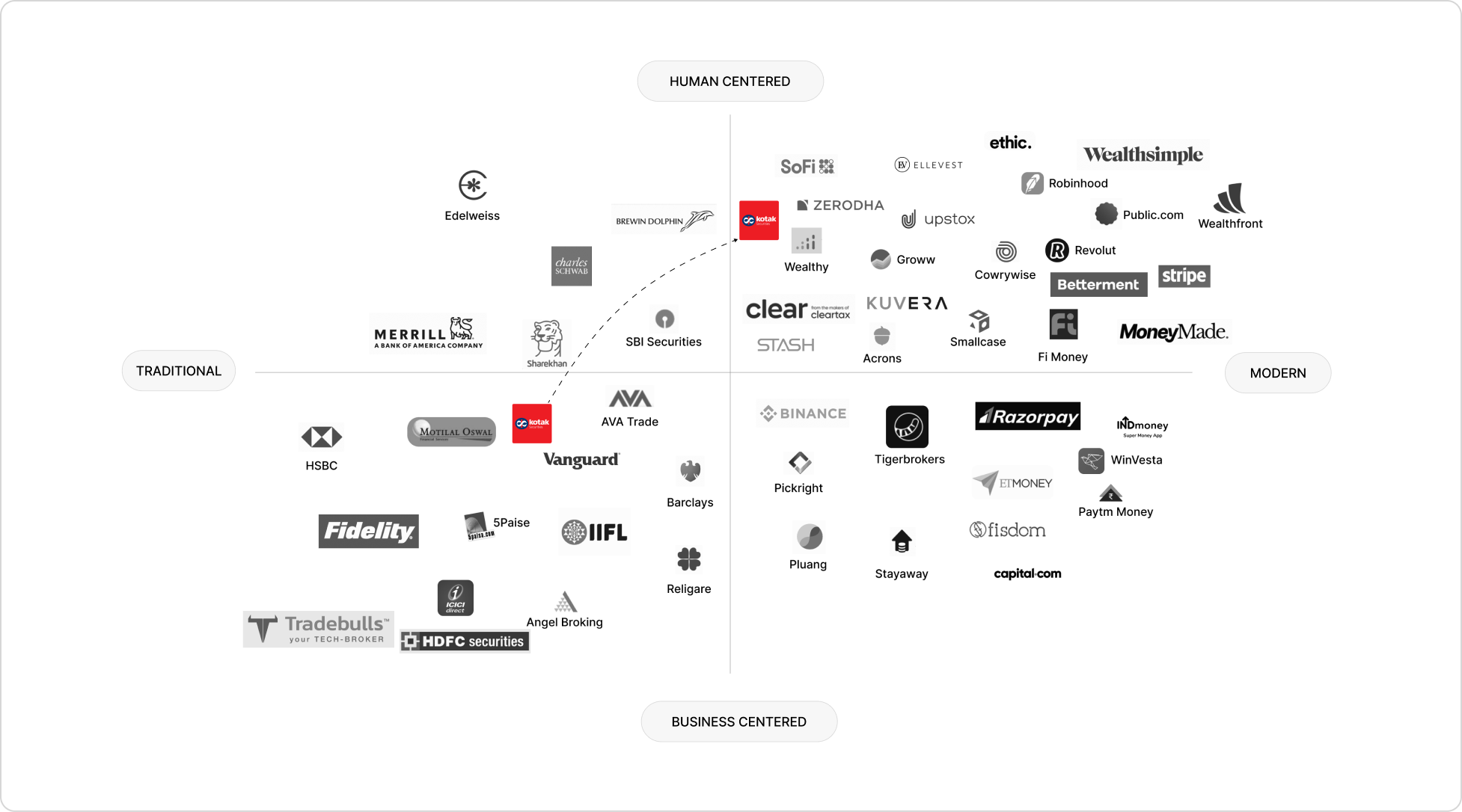
We mapped the market on two axes and set Kotak's goal: from traditional, business-centred to modern, human-centred.
Users
We wrote three personas and grouped their needs into two audiences. Early investors, like the Novice, need a safe first step. Active investors, like the Seasoned and Experienced personas, need the full product range and quick tools.
User story map
We mapped user stories across four journey stages: awareness, consideration, decision and engagement. With Kotak's team, we sorted them into three releases and parked the rest in an icebox.
Opportunity areas
For each section we designed, I asked:
Q1. Who it was for?(early investors, active investors or both)
Q2. Whether it should educate the user or move them to act?
I used the answers to choose its content and call to action.
For early investors (need a safe first step)
-
A small, safe first step
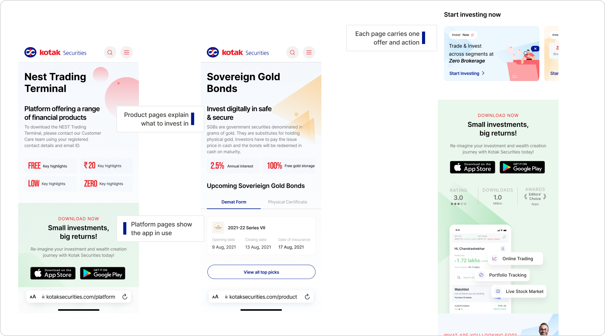
Each page carries one offer and action so beginners do not face a long list of choices.
-
One-field lead form
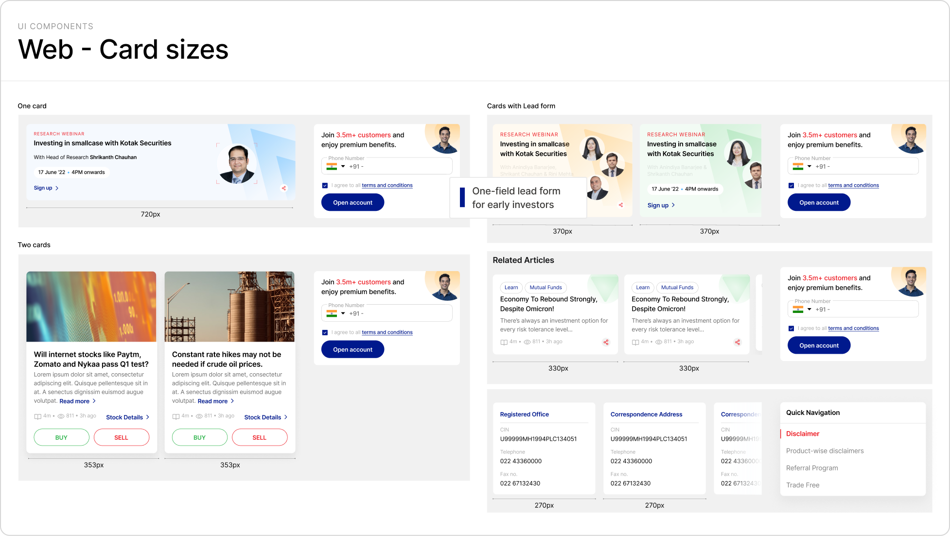
Long forms push first-time investors away, so each page uses the same one-field form.
-
Social Proof
Product pages repeat trust stats (25 years, 3.5M+ customers) and real users' words to ease the fear around money.
-
Product Vs Platform page
Product pages explain what to invest in; platform pages show the app in use, so beginners can tell them apart.
For active investors (the loyal base, who need range, speed and tools)
-
Live market ticker
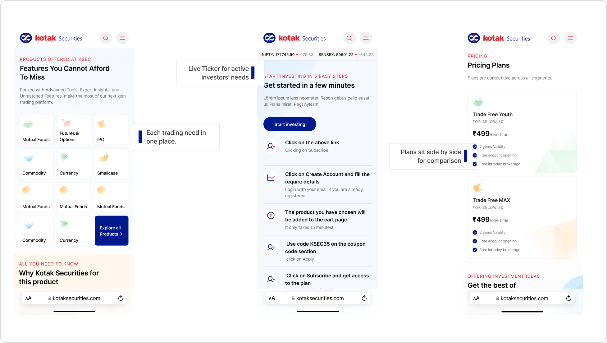
Active investors read the market wherever they land, and a live ticker keeps the whole site feeling current.
-
Clubbing products
The products section shows Kotak's full range at a glance, so each trading need is in one place.
-
Tools to decide
Calculators compare asset classes, estimate returns and work out fees, so investors check the numbers here.
-
Plans to compare
Plans sit side by side with the same price, validity and benefits.
Design System
Building the design system behind 100+ pages, from scratch
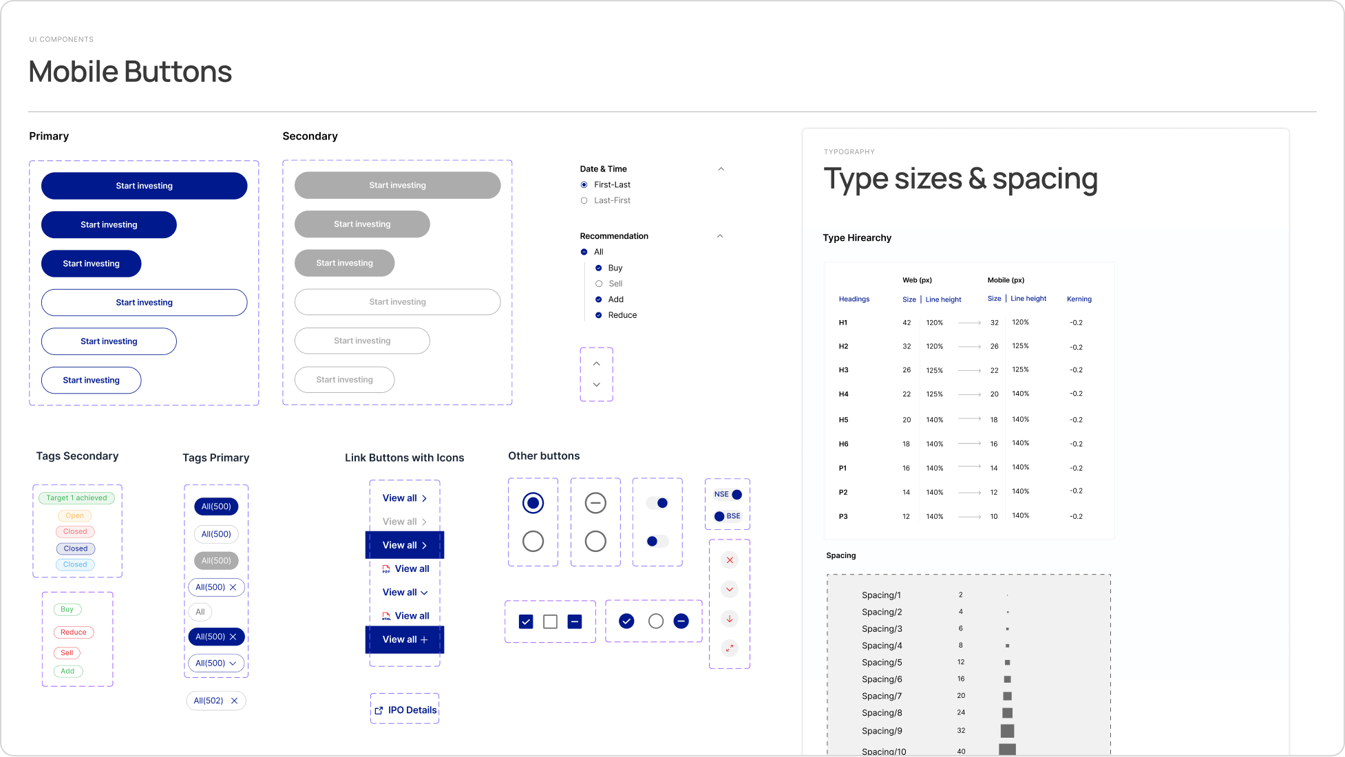
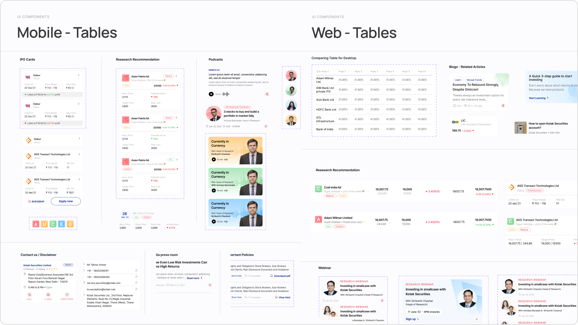
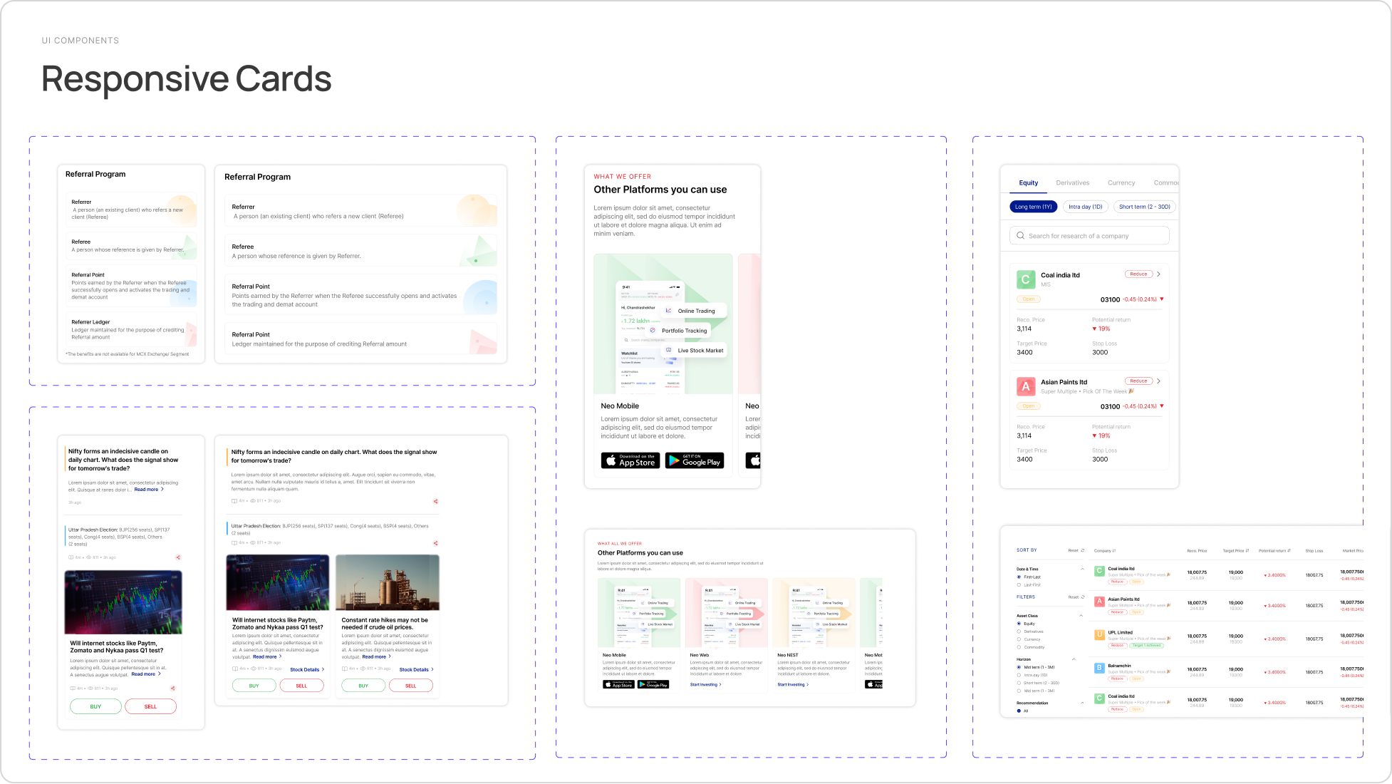
We built the design system from scratch: four variable collections (primitives, color, dimension and motion), 21 text styles and 60+ component sets. Buttons, cards, tables and text states each have a web and a mobile version.
We documented buttons, cards, tables and text with their states, sizes and usage rules, so developers could build without guessing. Kotak's team joined our daily stand-ups, so we reviewed decisions as we made them. Design QA then checked each build against the system.