Replacing a cold website with warmth, reassurance and clarity for patients
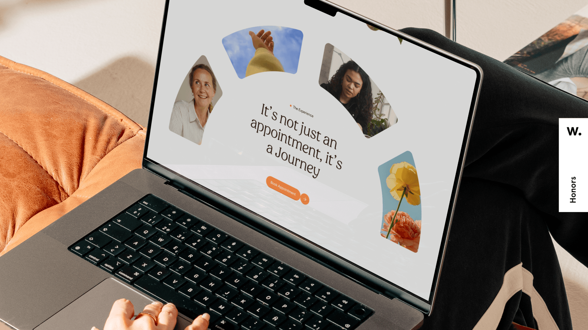
Klearmind website on a laptop screen, with an orange sofa and a flower in the frame

Challenge

The existing website suffered from disjointed and cold design with a poor user experience that didn’t reflect the compassionate care the clinic provided. For a brand built on healing and safety, this disconnect was unacceptable.

Solution

Through deep immersion and research, we studied the treatments and the emotional journeys of patients. The new identity and website introduced warmth, reassurance, and clarity through organic visuals.
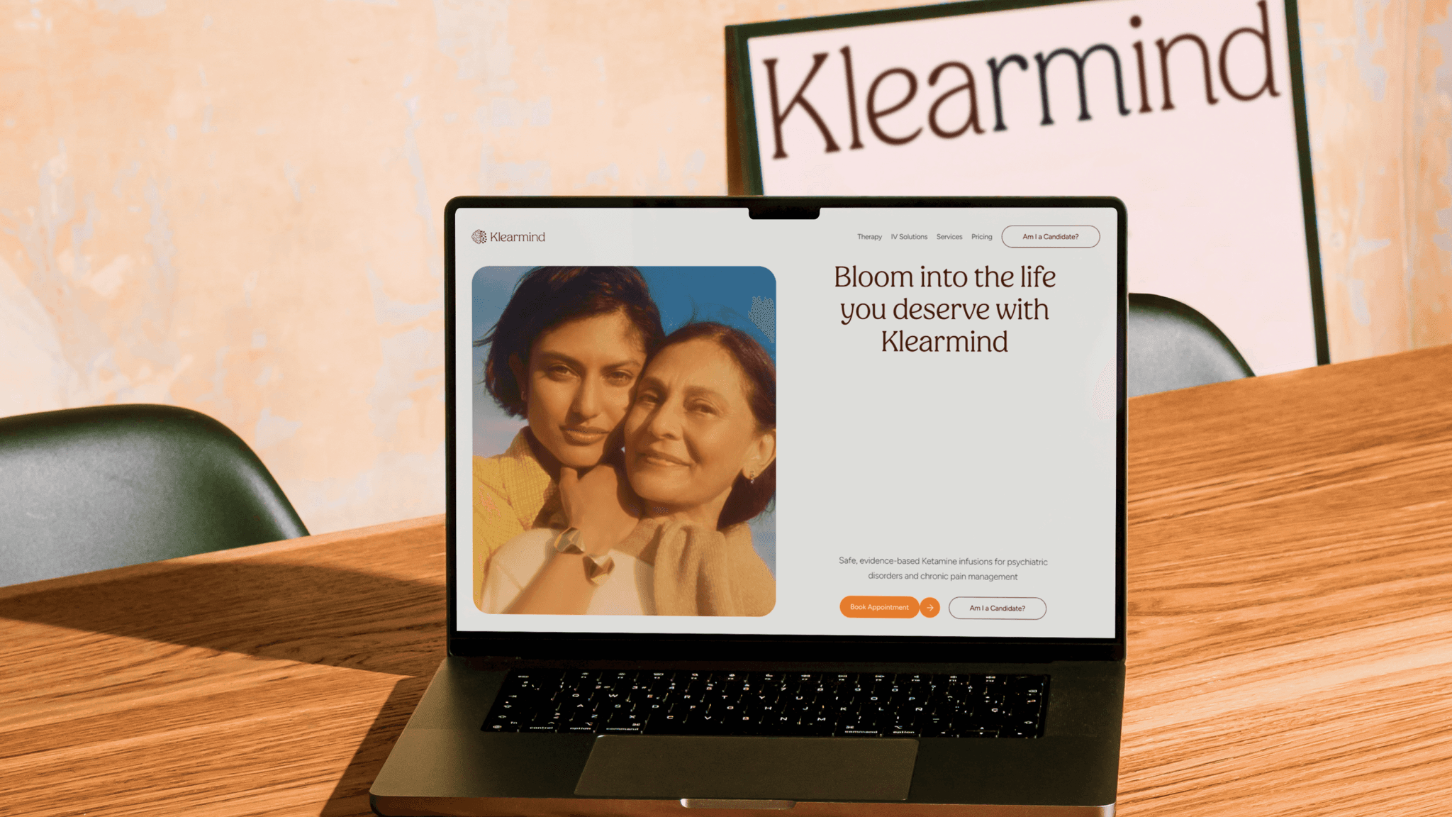
Klearmind website on a laptop at a desk, with the line "Bloom into the life you deserve with Klearmind"
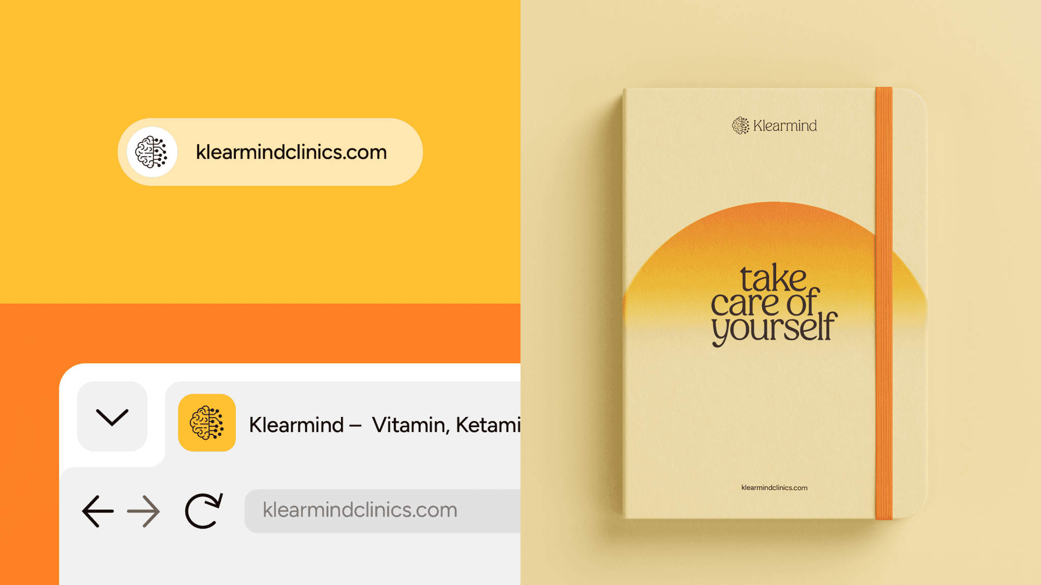
The Klearmind browser tab and web address on an orange background, beside a yellow notebook that reads "take care of yourself"
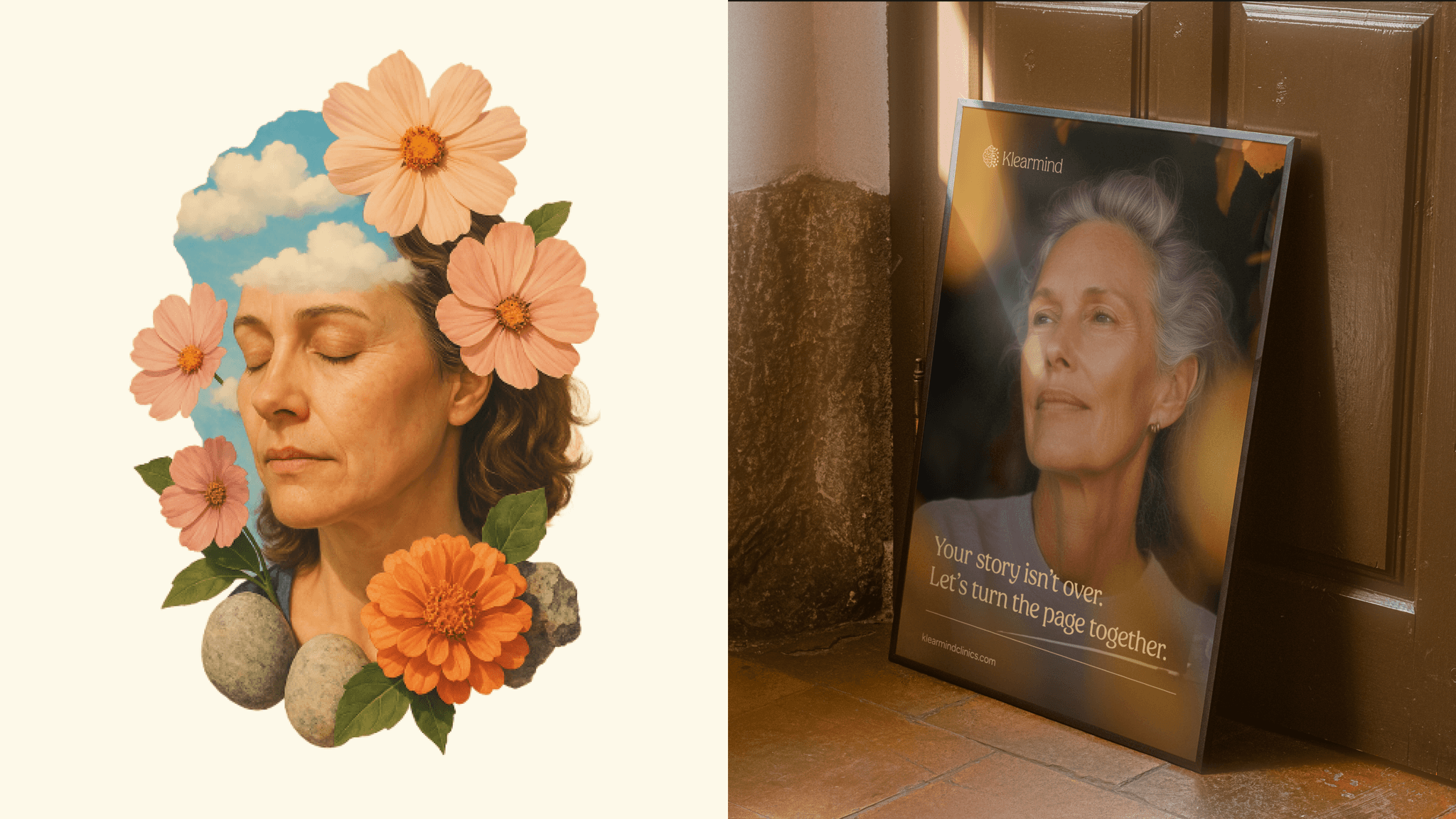
A collage poster of a woman with flowers and clouds in place of her hair, beside a framed portrait poster
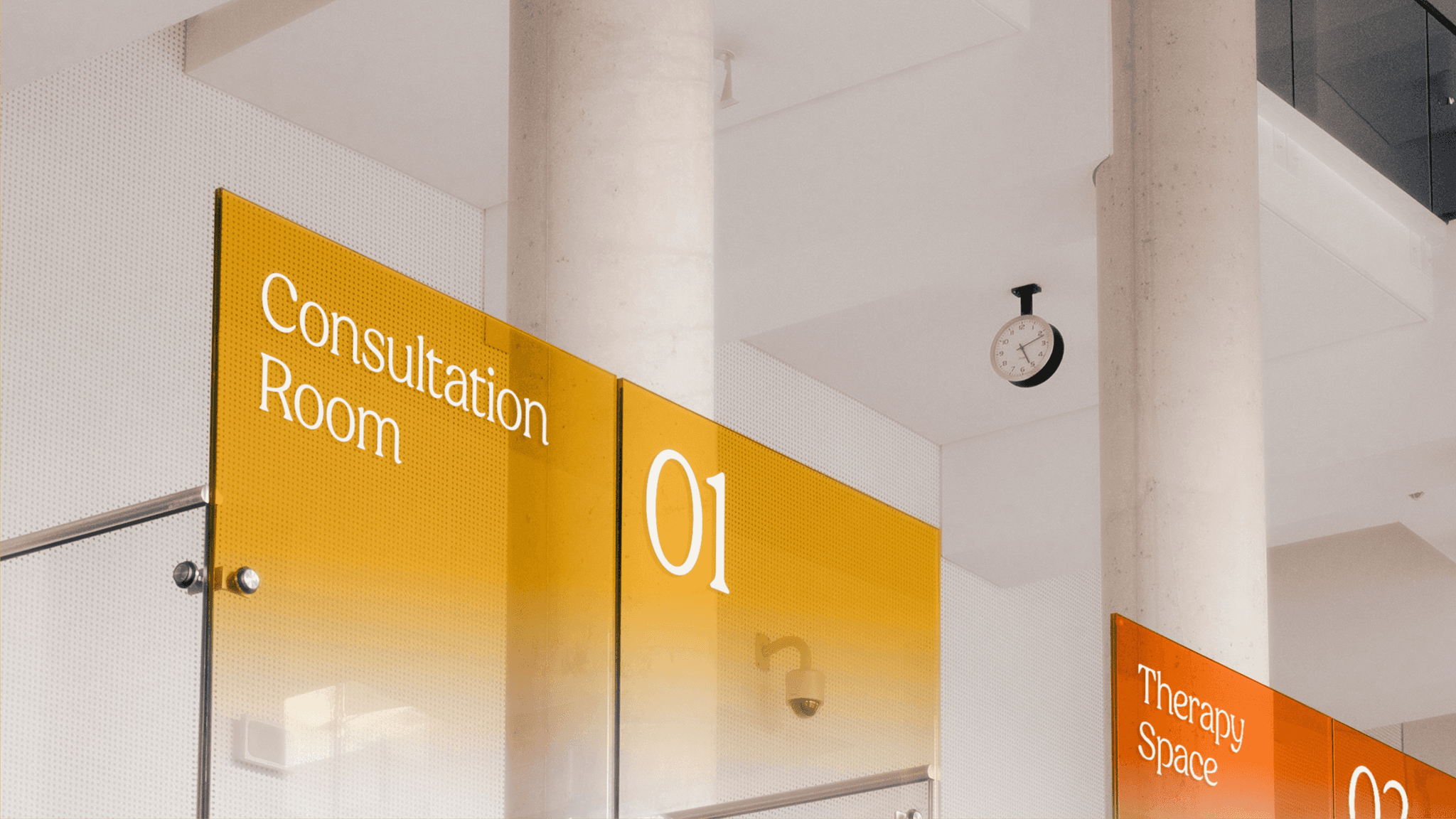
Clinic signs in orange and yellow: "Consultation Room 01" and "Therapy Space 02"
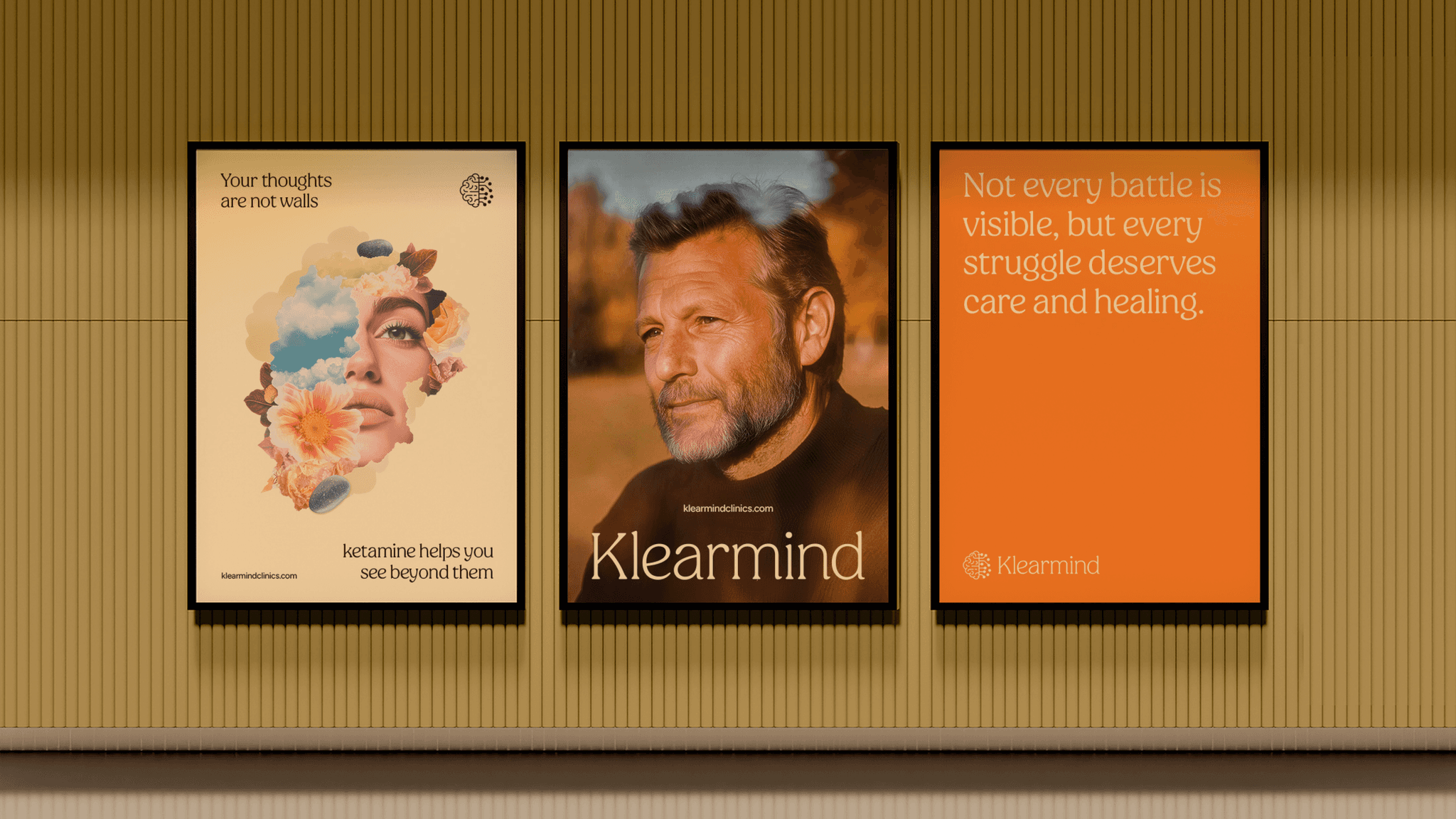
Three Klearmind posters on a wall: a collage, a portrait of a man, and an orange poster with a short message
The orange Klearmind app icon, and a phone home screen showing the icon beside Mail
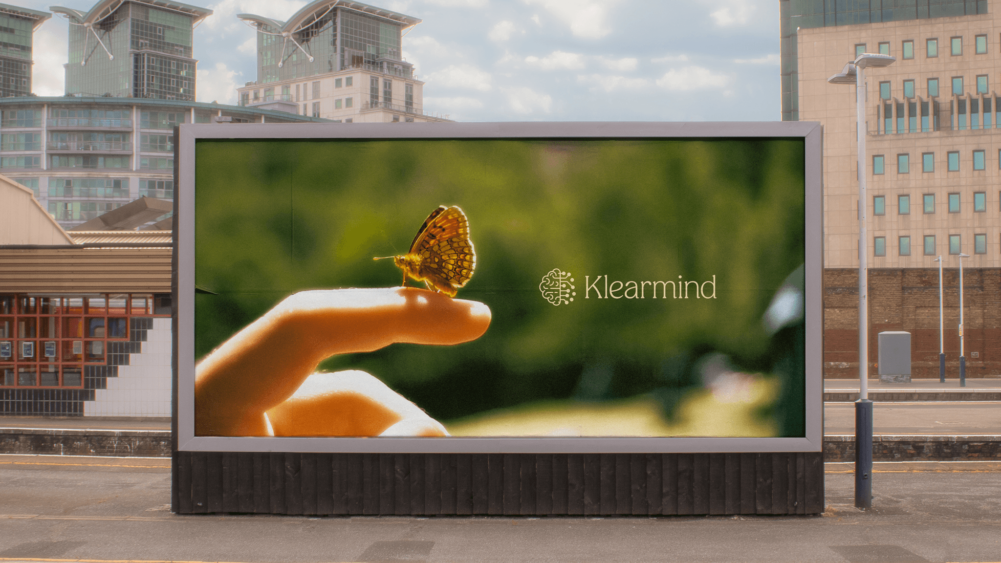
A billboard showing a butterfly on a hand with the Klearmind logo
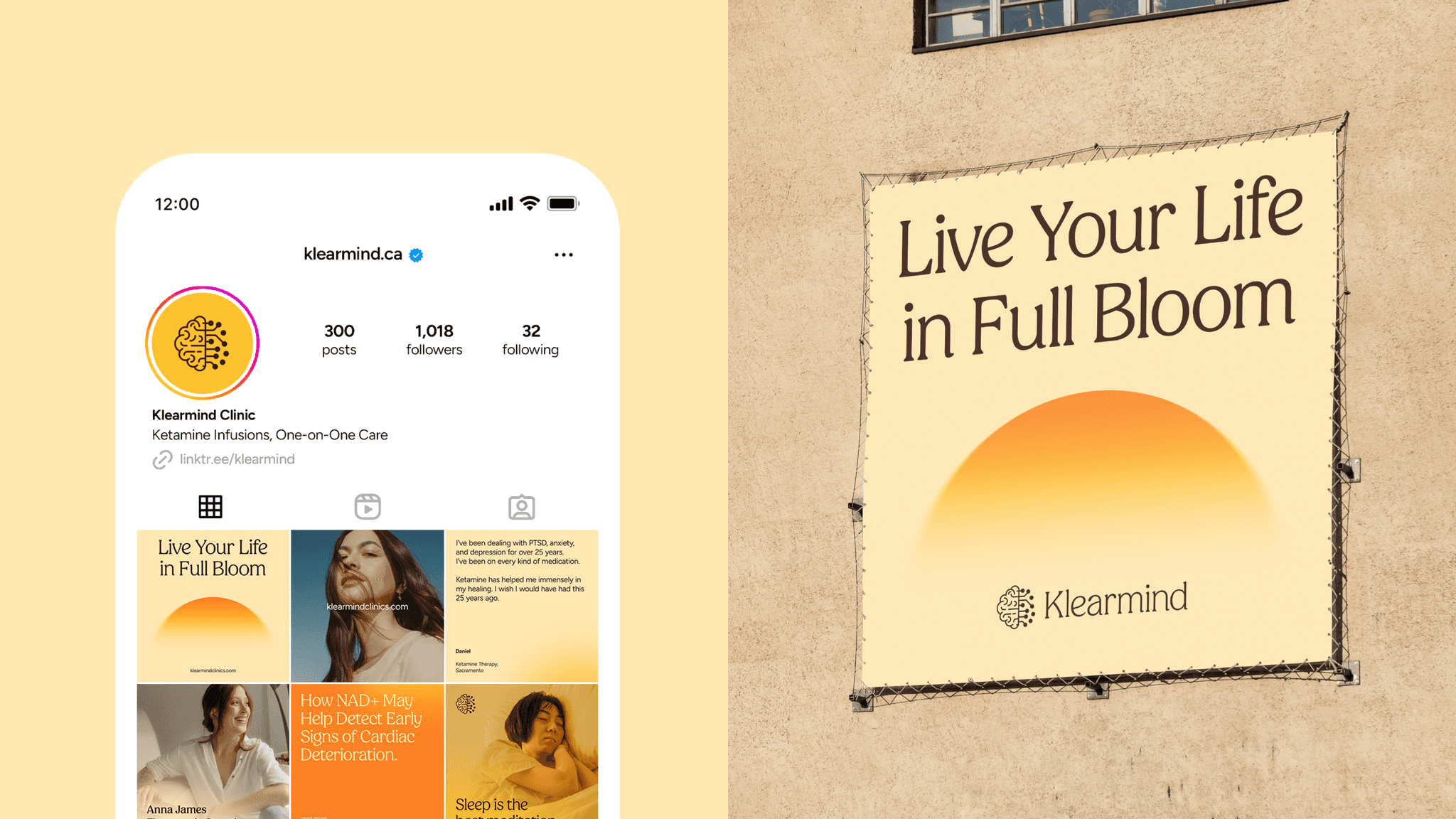
The Klearmind Instagram profile on a phone, beside a poster that reads "Live Your Life in Full Bloom"
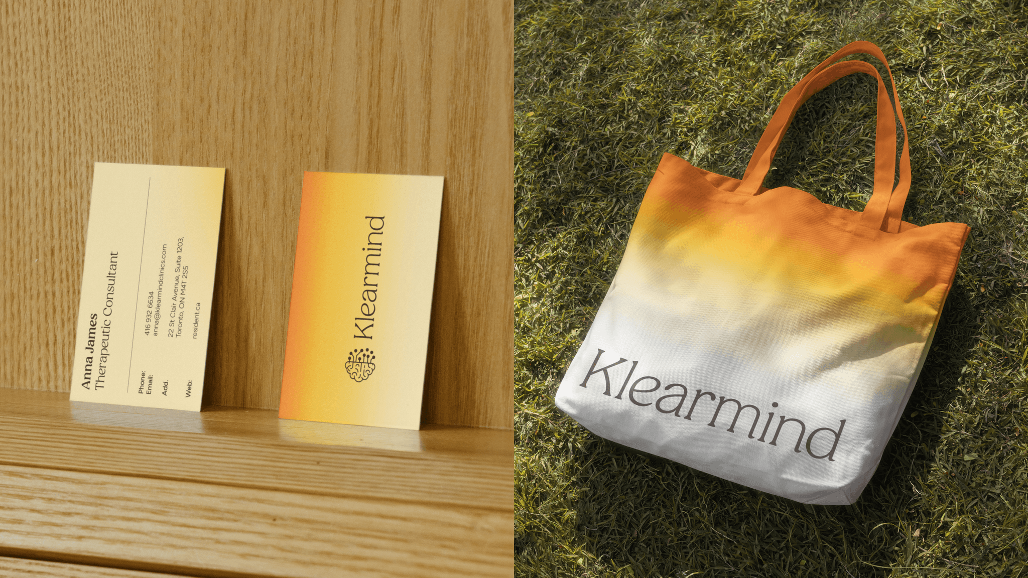
Klearmind business cards and a tote bag printed with the Klearmind logo